
A well-crafted landing page is a critical tool for any business, capable of significantly boosting leads and sales by compelling visitors to take a desired action. Whether aiming for purchases, newsletter subscriptions, free trials, or appointments, the fundamental goal of a landing page is singular: to inspire conversion. These dedicated single pages focus on specific topics or campaigns, designed to capture attention and guide visitors towards a clear objective. By implementing best practices in landing page design, businesses can enhance customer experiences and drive higher conversion rates, ultimately ensuring these vital lead generation tools effectively transform visitors into valuable customers.
Create Effective, High Converting Landing Pages With These 13 Expert Tips
1. Use Proven-to-Work Templates
You don’t have to build a compelling landing page from scratch. You can use ready-made website templates to construct just the right content for your campaigns and enhance results.
Taboola, for example, partnered with website building partners like WordPress, Wix, Instapage, and Elementor to carefully design these landing page templates, part of Taboola’s Landing Page Quick Start. Each template is created using recent trends and best practices from top-performing pages, so you can bring your native ad campaigns to the next level.
Whether you’re new to Taboola or looking to improve your current landing page performance, the process is effortless. Just select a landing page builder and seamlessly add content to the pre-designed template, which can be easily modified.
2. Craft Engaging and Targeted Copy
So, even if you have the right template and layout, the question remains: What content do you use to populate your landing page and grab people’s attention? Use these top tips to get started:
- Repurpose what’s already working. Again, you don’t have to start from scratch. Try taking your most successful blog post and repurposing it for your landing page to help meet your KPIs.
- Clearly state your value offer. This isn’t the time to beat around the bush. You’ve hooked visitors in and now you have to land the sale. So consider stating and restating your to-the-point value offer at the top, middle, and bottom of your landing page. A vintage T-shirt retailer, for example, might write: “Take your coolness up a notch with our soft, vintage t-shirts, now 50% off when you bundle 5 or more.” It states the product, benefits, and special discount in one sentence.
- Consider where your audience comes from. People who find your landing page via social media ads will likely be in a different mindset than those who come from Google Ads or a referral link. Social media users, for example, aren’t necessarily looking for something to buy. But people actively searching for terms on Google might be ready to make a purchase and solve a problem. So you might craft unique landing pages for each audience and use terms that speak to their customer journeys.
3. Qualify Leads Right on the Page
Your landing page copy should focus on solving a problem for a specific audience. Remember that you’re communicating with potential customers who have made it down the funnel, so craft copy that speaks to their unique needs and helps further drive leads.
Consider asking yourself these questions, for instance:
- How does it feel to be in their shoes?
- What do they need to improve their lives right now?
- How can your product or service fill that need?
Also, make sure you clearly mention who the product is for by calling out your audience with these landing page elements:
- Headline. Use terms like “you,” “People aged X,” or “People living in X.”
- Visual. Include a photo or video or people who look like your target customers.
- Testimonials. Choose representative quotes and success stories from satisfied customers in your target audience.
- CTA. Personalize the call to action (CTA). For example: “If you’re over 30 and want to get a quick loan, check your eligibility by clicking on the button bellow.”
4. Create a Compelling CTA
Wait, we’re not done with that CTA just yet! After all, this is the final frontier of your landing page. It’s the last thing someone sees before they submits their information or go to the payment page. So, naturally, it can have a huge impact on conversions.
And you can use these best practices to boost your CTA engagement:
- Use one CTA per landing page. Studies have shown that landing pages with a single link or CTA have a higher conversion rate—an average of 13.5%. This is about 2% more than pages with two or three links or CTAs.
- Incorporate key phrases. Use bold action words like “get” and “give.” Personalize copy with sentences like “Let’s build your offer.” And pair your lead-generation form with a CTA that demonstrates a sense of urgency, like “Get a 30-day trial instantly.”
- Seamlessly tie into landing page copy. Your CTA should be bold but it shouldn’t come out of nowhere. Make sure it ties into the copy already included in the landing page and just drives home your value offer.
5. Optimize Landing Pages for Mobile
More people now access the internet via mobile devices than desktops. So you might think optimizing landing pages for mobile is a no-brainer. But, surprisingly, it’s still an afterthought for many landing page designers and marketers.
So, how can you create a successful mobile landing page that drives conversions? First, consider the mobile buyer journey. How do mobile customers find your native ads and get to your landing pages? Incorporate copy and visuals that are consistent with their cross-channel experiences and path to purchase.
Also, use a simplified layout for mobile landing pages. Single-column templates, for example, with minimal visuals can help speed up loading times and improve mobile experiences.
6. Write a clear and connected headline
The first thing the visitor will read is the headline of your landing page. Within a second or two, it should make a clear connection to the language used in whatever medium from which the reader found you.
You don’t want to:
- Disorient visitors or force any unnecessary mental gyrations
- Be overly creative or clever
In other words, kick-off your page with a dummy proof headline that assures the visitor she’s arrived at a page that offers a solution to her problem.
I did a search for “SaaS CRM” and clicked on an ad that read “Zoho Online CRM Software | Empower Your Sales Team.” The logo in the upper left and subheadline assured me the landing page was about CRM and the headline made clear the purpose of the platform.
7. Remove links
The purpose of a landing page is to get visitors to take action—but not any action—one specific action (or at least a very small selection of actions). You need to resist the temptation to invite them to do anything else, including visiting other pages.
As such, your landing page should not include a website navigation bar, links, or menus of any kind.
This page suffers from information overload, a serious dose of visual chaos, and hundreds of links (in three different menus) that are remarkably distracting. Oh yeah, it also features a recipe book. This is NOT how you focus on your offer.
8. Press the problem, showcase the solution
A landing page needs to get to the point. State the value of your offer immediately in your copy and reiterate it where appropriate. Like most effective sales copy, a problem-solution sequence will serve you well.
Should your page be brief? Usually, yes.
What if you believe including several details, say features and benefits, will make the offer more compelling? Include them. Make them skimmable with design elements that break the story up into small pieces.
Whether your landing page is 50 words or 1,000, give it a thorough fluff test and take out anything that doesn’t make it more compelling to respond.
A landing page can feature a number of details and still be effective. This page from Uscreen does a good job highlighting the product’s benefits. (Though, the trio of choices—book a demo, sign up for a free trial, and watch video—is likely to dilute conversions.)
10. Show something meaningful
Don’t add stuff to your landing page for the sake of art. Clutter your page and you clutter the mind of your visitor.
On the other hand, you probably don’t want your page to be 100 percent copy. Include a relevant image.
- If you’re offering downloadable content, offer a preview.
- Offering software or demo? Again, a preview should be good.
- Offering a consultation? Put a friendly face on the page.
- Registering people for an event? Show the venue. Or the speaker. Or a cool shot from the last event.
I haven’t hit on every conceivable offer. Consider yours and rally up an idea to give your landing page some visual interest. If possible, show the reward.
I just created this landing page for my new website. Like most of my landing pages, it offers a free ebook, so I show and describe the free content. Simple, right?
11. Add trust-builders
Put yourself in the mind of your landing page visitor…. “Should I read, watch, listen to, try or buy this?” “Is it worth my time or money?”
Anything you can do to infuse your page with elements that foster trust and build credibility could be helpful. Consider including one or more various forms of social proof:
- Testimonials
- Reviews
- Customer logos
- Media mentions (“As seen on”)
- Verification or trust seals
- Accolades
- Security badges
- Guarantees
- Numbers, e.g. downloads, satisfied customers, shares, etc.
Awesome use of social proof here. Bravo Freshdesk.
12. Make small asks
Simple principle: the less you ask for the greater response you’ll get. Apply this thinking to your form:
- If you want more leads, include less fields on your form. In many cases, a simple email address is all you need.
- If you must qualify respondents, zoom-in on the data points that matter most and make it easy on them with check boxes, pull-down menus, etc.
- This principle will also apply to the amount of effort, time or money your landing page requests. If your goal is to build your email list, make small asks.
Uh, seriously, will you also need to know my blood type to fork over that amazing event brochure? The reader has to scroll just to find the button on this messy landing page, which provides an example of how to do the opposite of most of the advice in this article.
13. Test and refine your landing page
Optimize the conversion rate of your landing pages by running A/B tests. With A/B testing, you simply compare a control page (“A”) against a variation (“B”) that includes a significant difference of some sort.
After a period of time, or number of visits, review the results and pull the plug on the lower-performer. You can proceed with the winner or further improve conversion by conducting additional tests.
A/B testing for landing pages is not complicated. The experts at Unbounce say, “Launch, optimize and repeat.”
I recommend using A/B tests for elements such as:
- Headline
- On-page copy
- Call-to-action copy
- Images and video
- Form length and style
You might also consider testing:
- Your offer
- Button design
- Page design
- Social proof
10 Examples of Landing Pages that Convert
1. PANDORA – Fashion & Beauty – Increased conversion rate by 130%
To compel customers to purchase jewelry pieces from a new collection, PANDORA created a landing page free of distractions. They created eye-catching imagery, used simple and clear words and titles, and highlighted specific items from the collection.
2. Mornin’ Glory – Retail – Increased conversion rate by 1483%
With an incredibly visual landing page featuring some key trust-builders and information on their high-quality and affordable razors, Mornin’ Glory was able to improve their conversion rate substantially.
3. Israeli Ministry of Tourism – Travel – Increased conversions by 40%
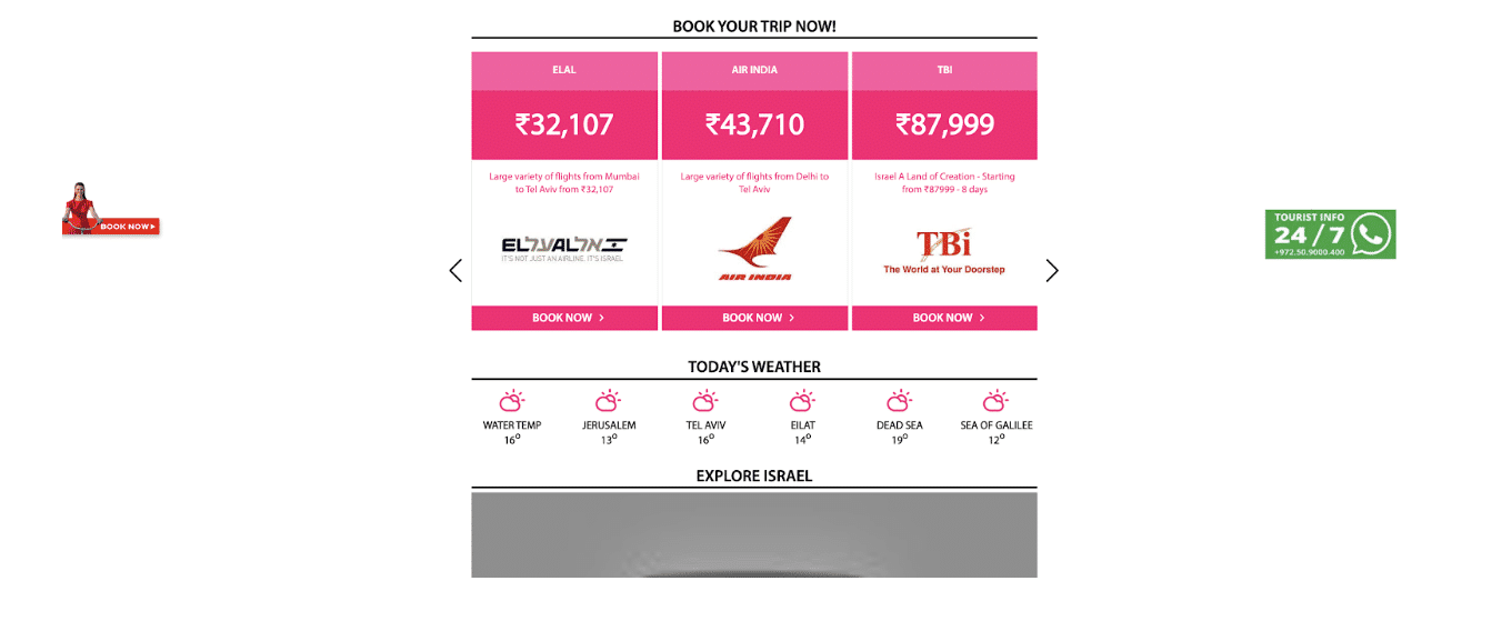
In light of a new direct flight from India to Israel, the Israeli Ministry of Tourism set off to create a landing page aimed at getting more travelers to book a trip. The above screenshot is just a snippet of the highly interactive and eye-catching landing page featuring guides of places to go and things to see, high-quality video content, and the above flights and weather. By providing potential visitors with relevant information, the Israeli Ministry of Tourism was able to increase conversions.
4. Simply Business – Insurance – 62.26% CVR
As a notoriously complicated industry, insurance is not often portrayed as approachable. Simply Business’ mission in creating this landing page was to do exactly that––take the mystery out of securing business insurance. By breaking the process down into three steps, using casual and concise language, and by presenting a clear CTA, Simply Business sees a conversion rate that is well above average.
5. Backlinko – Business – Increased CVR by 10%
How do you take a successful landing page and make it even better? Give users another chance to convert. In this example, that’s exactly what Backlinko’s founder, Brian Dean, did. By adding a second CTA below the fold, this page was able to increase conversions by 10%. In addition to the double CTA success, the page also clearly conveys the value behind converting and uses social proof to build credibility.
6. CollegeBoard – Education – 77.38% CVR
What better way to get someone to convert and convert now than by creating a sense of urgency? On this landing page, CollegeBoard reminds visitors that the SATs are rapidly approaching, and that failing to sign up would result in missing an opportunity to “join millions of students across the country.” This sense of urgency, alongside a snackable list of the SAT’s value-adds contributed to the overall success of the page.
7. ConvertFlow
Digital marketing, lead generation –– Simple, sleek, and personalized
Since they’re in the business of landing pages and conversion, it makes sense that ConvertFlow would nail a killer landing page. The design is very simple and trim but includes everything necessary to educate the visitor and prompt them to fill out the form. Additionally, the final question on the brief form helps segment respondents so they are directed to the most appropriate demo scheduler, offering a more personalized experience that boosts conversion.
8. Mama and More
Home improvement, lifestyle –– Lead generation and email course conversion
Kaylee Strozyk is a talented and experienced digital copywriter, so creating a high-converting landing page for her side hustle came naturally. This simple, informative page combines the above-the-fold simplicity that grabs targeted visitors right off the bat with sales letter-style copy that quickly convinces tire-kickers. And, since this is a free email course, the barrier to entry is low and the perceived value is incredibly high.
9. Skuma
Mineral water –– Enhanced conversion thanks to simplicity and quality copy
Selling water has never been a simple task since most of the world has access to the basic product for free. However, when targeting an affluent demographic with money to spend, a company like Skuma offers a powerful incentive to buy: purity and enhanced mineralization. Simplicity and effective information delivery are key factors in the success rate of this landing page which takes the visitor through three distinct waypoints: the product features, differentiation, and a clear call-to-action.
10. SoftwarePundit
Affiliate sales / SEO –– High conversions for someone else’s product
SoftwarePundit serves as an affiliate for the popular SEMRush SEO SaaS platform, and this landing page is responsible for its success. Unlike many on this list, this page relies on heavy copy to provide all the information necessary for a tire-kicker to become a paying customer. The page features a Table of Contents to facilitate quick navigation. Importantly, calls-to-action are prominent throughout the lengthy copy so visitors can move ahead the moment they’re convinced.
What is a Good Conversion Rate for a Landing Page?
Before we dive into the variables that make a landing page successful, it’s important to understand the benchmark of that success.
The average landing page conversion rate across all industries currently clocks in at about 2.35%.
But, this number doesn’t tell the whole story. Landing page performance varies greatly across industries, so understanding the standard of “good” in your particular industry is key for setting your own KPIs.
Here is just one industry-specific breakdown found by WordStream.
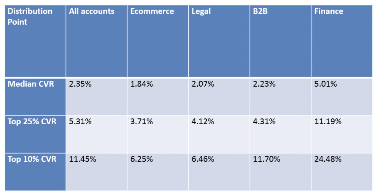
(Source: WordStream)
Get More Conversions From Your Landing Pages
A great landing page can mean the difference between having zero, 100, or even 1,000 new leads and sales a day for your business. Building a great landing page can seem complex, but remember that you don’t have to start from scratch. Use these top tips to craft engaging copy, eye-catching CTAs, optimized pages that drive results.
Also, make this process even easier with Taboola’s data-driven landing page templates, Taboola’s Landing Page Quickstart. All you have to do is choose your design, enter your content, and publish. With the right tools and strategies, you can keep customers moving along the funnel and meet them with compelling offers they just can’t refuse.


