BRINGING OUR BRAND TO LIFE

Welcome to Taboola’s brand resources page. This is where you can find and download the brand assets you need. Our brand guidelines are about making sure that our brand looks and speaks the same across all media. Please help us keep its spirit.

Download Brand Guidelines (PDF)
icon

This is our official logo.

Download Blue Logo
icon

Sometimes we use our smiley face icon. The same rules apply.

Download Blue Icon

We use a white logo on images with colorful backgrounds. This helps our logo POP!

Download White Logo
icon

We use a white smiley face icon on colorful or dark backgrounds. This keeps our smile bright!

Download White Icon
icon

OUR LOGO

We use white logo on colorful image background and on solid color, any color except white.
On white background we use blue logo. Sometimes we use our smiling face icon.
Maintaining a consistent amount of space between our logo and other graphic elements is important.

Download logo kit

LOGO DON'TS.

icon

Don't Reflect

icon

Don't Shade

icon

Don't Crowd

icon

Don't Distort

ICON DON'TS.

icon

Don't Encircle

icon

Don't Write

icon

Don't Crop

icon

Don't Outline

LOGO DON'TS.

icon

Don't Reflect

icon

Don't Shade

icon

Don't Crowd

icon

Don't Distort

ICON DON'TS.

icon

Don't Reflect

icon

Don't Shade

icon

Don't Crowd

icon

Don't Distort

BE BOLD

Primary Font:

Helvetica Neue

Helvetica Neue Tn 35

abcdefghijklmnopqrstuvwxyz

abcdefghijklmnopqrstuvwxyz

Helvetica Neue Lt 45

abcdefghijklmnopqrstuvwxyz

abcdefghijklmnopqrstuvwxyz

Helvetica Neue Md 65

abcdefghijklmnopqrstuvwxyz

abcdefghijklmnopqrstuvwxyz

Helvetica Neue Bd 75

abcdefghijklmnopqrstuvwxyz

abcdefghijklmnopqrstuvwxyz

Secondary Font:

Arial

For presentations and emails (as a system font) we use Arial and Arial black.

THIS IS HOW WE WRITE IT

H1 | Be Bold

This is how we write it

H2 | Be Modern

This is how we write it

H3 | Be Clean

This is a paragraph written in helvetica. It’s perfect for reading and long copy. It’s the standard for readability.

Paragraph | Be Clear
icon In titles, we don't use more than 2 or 3 words in a row.
icon Align titles and logos to the left side of the composition.
icon Our titles are always left aligned.
icon We always adjust line height to less than auto.

What makes a photo right for us

DIFFERENT.

AUTHENTIC.

HONEST.

What makes a photo right for us

REAL

MOMENTS.

NO FILTERS.

What makes a photo right for us

A STORY

A STORY

YOU LOOK TWICE.

What makes a photo right for us

PEOPLE

EXPLORING

THEIR PASSIONS.

OUR COLORS

Our signature color is blue but not because we feel blue. We want our color palette to communicate innovation and trust.

Dark Blue

#054164

Backgrounds presentations only

Deep Blue

#004b7a

Backgrounds and Titles print + web

Taboola Blue

#00659f

Taboola Official Blue Use for everything

Happy Blue

#008acb

Icons and Buttons print + web

Sky Blue

#00b5d9

Icons and Buttons print + web

Green

#54bd86

Icons and Buttons print + web

System and Online Colors

#e86861

#ffca0a

#00a86d

#00cb84

#66d5db

#4472c4

Pantone

7693 C

OUR COLORS

The bigger the square, the more its color should be used. Use touches of green and sky blues to make your design more interesting (e.g. for buttons and icons).

PRODUCT IMAGES

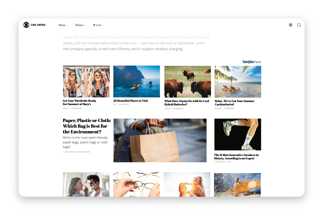
Download screenshots of our products, these are approved for public use.
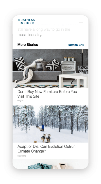
Download Product Images
Taboola Feed Taboola Feed